
Every project teaches you something and then taunts you with that knowledge—it whispers, you could always do that part better on the next project! Root taught me that it’s possible that good aids can do more than help players remember rules they already knew, but actually teach large parts of an intricate game: in tests, I often asked players to learn their factions just by reading their player boards, and it paid off. In a perfect world, people could sit down at the table and learn the game without looking at the rulebook or watching a how-to-play video. For most games this isn't fully possible, but it's still valuable to get as close as you can. However, ultimately, Root didn't go far enough, since many of its core rules remained buried in the rulebook—you need to use the walkthrough, which isn't great for referencing later.
Coming to Ahoy, I wanted to build on Root's approach and teach basically the whole game through its aids. As with Root, Ahoy teaches its factions through its player boards, but it adds a few more aids: First, the aid cards for the factions’ unique pieces, such as the Bluefin Squadron's Patrols (the little shark fins). Second, the setup aid on the back of the Fame Track. Third, and the focus of this diary, the pocket guide, which teaches most of the core rules. It's a tiny bifold with four pages—three if you omit the cover page, which doesn't have rules, and my goal was to fit the game on it.

In this diary, first I’ll talk about usability testing, a key element of user experience work that I used to iterate the pocket guide, and then give a detailed walkthrough of how the pocket guide evolved.
The Usability Test
So, the usability test. It's important. Basically, in a usability test, you put your game in front of players without explaining anything, and see whether they can understand it on their own. However, you can run a usability test in many different ways: For example, it could be moderated or unmoderated, depending on whether you're present. It could also be specific or holistic, depending on whether you focus on one element (the rulebook, for example) or the entire process of learning and playing from beginning to end.
These different methods collect different information. For example, I’ll often do a rulebook read—just put the rulebook in front of someone and say, "Read this and talk about your thoughts and confusions aloud." The rulebook is extremely important to get right, and this test is a quick, simple, and effective way to improve it over and over again as I run test after test. However, a rulebook read only tells me about a person's thoughts, not their actions. They could read a rule and express no confusion, even though they misinterpreted it. It also doesn’t tell me much at all about whether the rest of the game—its aids and components—are supporting the learning process.
To reveal those confusions and get a fuller picture, I'll run a usability playtest, where a group learns and plays the game with nobody guiding them. However, this process is much slower—a rulebook read for Ahoy takes maybe an hour and change, but a usability test takes three, four, or even five hours, when accounting for organizing the session, updating the physical kit, getting to the test location, and talking through expectations. And not only does it take longer, but it needs more people—four or five, rather than two. Overall, a usability test for Ahoy takes around 20 person-hours, compared to around 5 person-hours for a rulebook read.
Given all this extra time and effort, you’d hope a usability test would give the whole picture, but unfortunately it doesn’t. Unless you're making a simple abstract game, your players won’t touch all, or even most, of your game in one sitting. All of this is to say: there's no one-size-fits-all test, and you need to approach usability from many angles.
For the pocket guide, I tested in two main ways: aid-centered usability tests where I prompted a group to learn from the aids and then play a full game, much like for Root, and one-on-one tests where I asked a single person to teach me how to play from the pocket guide, having them demonstrate the game physically as they went to check their understanding.

Instant Iteration
Beyond figuring out which tests you want to run, you also need to decide when you implement fixes. The field of usability originated in settings with huge budgets and long timelines where the cost of testing was high, but the cost of changing something was even higher, and the cost of bad changes was highest of all—think airplane cockpits. In these settings, it makes sense to run tons of tests before you think about changing anything, but this means you spend a lot longer wondering whether your fixes will actually work. When making games, though, budgets are smaller, timelines are shorter, and stakes are lower. (Nobody's going to die from getting a rule wrong...probably.) So when it's doable, testing fixes immediately is quite useful, and I did so extensively for the pocket guide.
Basically, I kept the guide loaded in layout software on my laptop in front of me. When the players really struggled to interpret a rule, I’d take a moment to consider what's causing the issue or ask them to talk through it, then I’d edit the guide, show them the new text without explaining it, and ask them to interpret it again.
This method does have some limitations, though. First, it only really works in person—it's just too hard to change something and show the new version to the players remotely. Second, it only works if you don't give away the correct interpretation. This is true in all usability testing, but it is especially difficult to keep silent and neutral when you're making and presenting changes on the fly, and sometimes the timing of when you make the change will give things away. If your player can guess what the correct answer is from your actions, rather than the text, you won't know if the change actually helped anything—it might have actually made the problem worse. So a real poker face is needed. If you go into the test tired or frustrated, it’s probably best to avoid! Finally, it should be used sparingly later in development, because every late change should have a very good reason, usually observed over multiple tests.
Instant iteration also has some downsides: If you're focusing on fixing the problem so you can test the change immediately, it's easy to forget to write down the problem itself. If you're not writing things down, it's much harder to sit down later and synthesize those problems into insights and learn from your mistakes over the long term. (Incidentally, writing a development diary helps counteract this!) Likewise, you might miss an opportunity to solve the problem at a deeper level by changing the rule itself, which you generally can't do until after the test by collaborating with the designer. That said, it's a good method to have in my toolkit, and I used it quite a lot for Ahoy’s pocket guide, especially in group tests. Hearing multiple people interpreting changed text in real time is a rich source of data!

Iterating the Pocket Guide
For the rest of this diary, I’ll walk through six versions of the pocket guide. (This is a simplification for clarity’s sake—in reality, there were many more: dozens and dozens, each full of little changes.) This will show how the sausage gets made, and it’s messy: many changes will seem trivial, and many get reversed. You may find it interesting, or boring, but it’s real development! I’ll highlight some notable changes and patterns, but leave a more detailed read to you. For full resolution where the text is easily readable, you'll need to click the images to open up the original versions—keep clicking until it becomes clear! These images will show roughly where changes happened, but be warned: PDF comparisons are never perfect. Anyway, enough waiting. Let’s jump in the water!
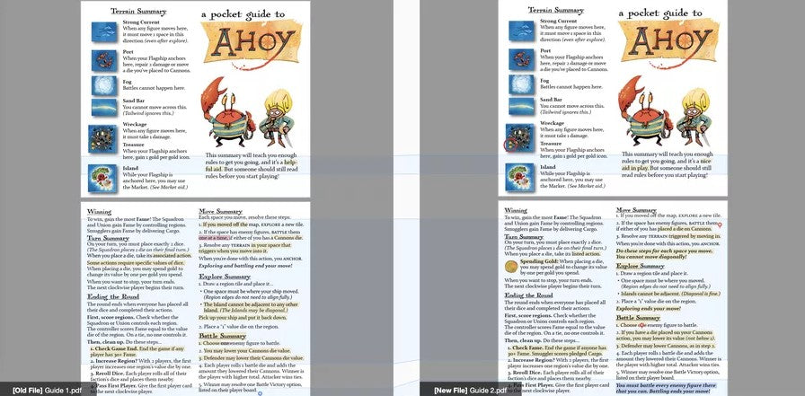
Version 1 to 2

Words split across lines. Let's start with something simple, almost trivial: the only difference on the front page is a change from “helpful” to “nice.” Tweaks like this may be mundane, but they're a ubiquitous and important part of editing laid-out text: words are simply harder to read if they cut across lines, so let's minimize that.
Signposting for reference. On the left page of the back spread, I added an icon for gold and a Spending Gold header. In testing, many people glossed over this rule because they didn't realize how important it was yet, and then later in play became frustrated trying to remember where to find it. Adding these signposting elements made it much easier to find when needed.
Info at point of use. On the right page of the back spread, I split out the note “Exploring and battling end your move!“ from the Move Summary into the Battle Summary and Explore Summary. Generally, testers read the three main steps of the Move Summary, then ran through the Explore Summary or Battle Summary as needed. But then—because most of Ahoy’s movement actions give two or more moves—they’d go right back up to the first step of the Move Summary, which means they'd miss this important rule. Splitting this out into the relevant sections made it harder to skip.
Cuts for page space. Even though splitting up the previous rules got the info in the right places, it did add a line of text. Since we started with a full page, now we're flowing over the margins, and that means cuts! You'll find various shortening and outright removals of clarifying text. Early in this process, it’s safe to do this, since you can always put the text back in later if it's truly needed.
Diagonal movement. I added that you cannot move diagonally at the bottom of the Move Summary. If there's one thing to know about writing rules for board games, it's that people always want to know whether they can move diagonally!
Physicality of the Cannons die. The Move Summary and Battle Summary often talk about a "Cannons die." Testers would read this, look at their player board, and get confused—often, they’d think that the die printed on the board itself, rather than a physical die on it, counted as a Cannons die. It may sound bizarre, but this is why testing is essential—what seems obvious to you is often confusing to others!
Battle triggers. The hardest part of teaching how battling works in Ahoy is "Who am I forced to battle, and when?” Version 1 totally lacked an explanation of this, so I add You must battle every enemy figure there that you can. This is still deeply incomplete, and you'll notice in later versions how I gradually add to this point, move it around, and refine how it differentiates who you need to battle.
Version 2 to 3

No changes on the front.
Move order. In the previous version, to save a line of space I moved the text Do these steps for each space you move from the top of the section to the bottom. Bad idea, since this text frames how the action works! It'll move back up top later, when I realize my mistake.
Connecting aids. Under the second paragraph in Ending the Round, I added an explicit reference: “as described on the player boards." When you reference a rule, don't assume the player knows just where to look, even if the answer is literally right in front of them! Guide them.
Cannons physicality. Thought I needed to lean into physicality to teach Cannons before? Well, it needed more—here, in the Battle Summary, I say explicitly, “You may turn the die.” In Version 2, which said “lower the die,” testers understood that they needed to do something with the die, but didn't know what. “Lower the die" is just not a common phrase, even in game rules, and even though some people got it after thinking for a bit, it slowed down play.
In step 2 of the Move Summary, though, I don't follow my intuition for physicality. I change “has placed a die on Cannons” to “has a Cannons die” to make space for all the relevant rules, but I’ll regret this later. This work is messy, and testing your changes is essential!
Version 3 to 4

Page size. After a lot of hair-pulling, I conclude that the booklet's pages just aren't large enough. If you ever wonder why a particular rule, whether in a rulebook or on an aid, seems a bit terse or unnatural, the answer is usually that there's not enough space on the page to write it out fully. With the larger pages, you'll find many places where I've used the extra space simply to write things out in full, natural ways, such as referring to the "Bluefin Squadron" and "Mollusk Union" rather than simply the "Squadron" and "Union" (which is surprisingly important), adding "may" and "must" to relevant places, and expanding awkward phrasings like “Higher total is the winner” to "The player with the higher total is the winner.” In the Move Summary, I fixed my mistake of removing the physical description of the die placed on Cannons.
Graphical signposting. Now the important callouts have a background stripe of a different color. Never underestimate the power of styling!
Physicality for wealth die. The Explore Summary, step 2, now says to place the die "in the center" of the region. This fix may seem silly, but many testers would place the die on one of the printed Tailwind dice symbols in the corners of individual spaces, rather than in the center of the region tile!
Tailwind description. I added a description of the Tailwind die icon to the Terrain Summary. Testers often looked at the Tailwind action on their player board and assumed it was referring to the wealth die on the center of the region tile, rather than the printed tile.
(And even though we're not focusing on the player boards here, the other relevant change here was adding "in the corner" to the Tailwind action on the player boards themselves—“Move your Flagship directly to a space with this die in the corner.” This clarified the reference really well since there are no physical dice in this game that go in the corner of something. This wording worked even better than saying things like “…with this printed die" or "...with this die value” or "...with this printed die value." Just like with the Cannons die, try adding physicality to your description if people are confused!)
Version 4 to 5

Context for spending gold. In the Gold sidebar, I've added “Some die slots only accept specific dice.” Previously, it was not clear why you'd want to change the value of a die. Adding this context helps answer this question and teaches an important rule, which is implied but not explicitly taught by the player boards.
Play structure. In both the rulebook and here, testers often got confused about when a round ended and when dice got rolled: Some thought the round ended after everyone had placed two dice. Some thought you rerolled your remaining dice after every turn. Two changes were critical to fixing this: the added “(Not the round!)” near the end of Turn Summary, and the change from "The round ends if…” to “Keep playing turns until…” in Ending the Round.
Union plan reminder. In testing, a common hiccup was the Mollusk Union player forgetting to draw their plans at the end of the round, which would guarantee a bad time, to say the least! Even though this reminder to draw is on the Union's player board, it needs to be where most people will see it—if people are ending the round, they'll learn how by reading this aid, not the Union player board. Likewise, because every player has their own pocket guide, anyone can remind the Union player to draw their plans—distributing relevant information in multiple places helps players support each other!
Regions vs. spaces. I added this distinction to the top of the Terrain Summary. This distinction is especially important to include since it affects how you gain Fame at the end of the round!
Bolding key terms. You'll see bolding now on Explore, Battle, Terrain, and Anchor, in addition to their smallcaps style. This makes them stick out more and implies that they're linked to info found elsewhere in the pocket guide.
Version 5 to 6

Graphic design revamp! It's fitting to end here, because this new version was all Pati Hyun, our wonderful graphic designer, cleaning up my messes and making everything cohesive. Every creative project is a collaboration, and I'm honored to work with such a great team.
An Admission
Thank you so much for reading! There’s one thing I should note before wrapping up: I've cribbed some of the early part of this diary from an interview I gave a little while ago. If you want to read more about the topics I’ve covered here, check it out here.
- Josh Yearsley
Find the original post on Board Game Geek!
Pre-order Ahoy starting August 1st!