
When developing Fort, I think the icon system and layout were easily the most important parts of my job. Having played SPQF, I knew the mechanical structure of the game was already rock solid, but as I shared the game with others it became clear that the icons and layout often tripped new players up. Because they were spending so much time trying to parse their cards, they had less time to think about the actual gameplay.
The first thing I did was decide on a (generally) consistent layout for the cards.
In the original game the art is integrated with the iconography.
:strip_icc()/pic5480798.png)
:strip_icc()/pic5480801.png)
I personally really enjoy this intradiegetic approach (UI and icons exist in the world). When the user interface and icons exist as objects within the world of the game, players often feel a deeper sense of immersion. Originally, I planned on adopting this strategy for the new edition and sketched up Fort in this style.
:strip_icc()/pic5480803.jpg)
However, as I pursued this choice, it became clear that this approach was part of the reason some new players had trouble understanding the game’s graphics. There were basically two things causing trouble.
First, the intradiegetic style obscured one of the game’s core mechanisms: private vs. public actions. Public actions can be followed (copied) by other players on the active player’s turn. In contrast, private actions can only be taken by the active player. In the old layout, the subtle distinctions between these two actions led players down a rabbit hole of rules checking, comparing with other cards, and reflecting on what they did prior. This is the exact opposite of the flow state I wanted for them.
The second reason for the change was also related to flow and was about consistent scanning of the table. At the end of a turn in Fort, you may have a pool of 9+ cards to choose from, and that pool may contain completely different cards from last round. This is a significant information dump, and I needed to lay out the cards in a way that let players eliminate choices rapidly. So I asked myself and my players, “What are the first questions you ask yourself when selecting a card?” And it often went something like this...
Which suit do I want?
What action do I want?
Which actions are public and private?
The goal was to make it so as soon as you know the answer to these questions you can eliminate some pool of the cards. Questions 1 and 2 would be handled by the icon system, which I’ll talk about in a moment. But having a consistent layout for the cards allows players to continually apply the same thinking and questions to all cards rapidly. It also emphasizes when that pattern is broken. Take this card for example...
:strip_icc()/pic5480799.jpg)
As for the icons, instead of thinking about actions on cards as singular ideas that need to be communicated, I put my effort into creating a “language” that could be easily learned. We could then use that simple language to express complicated ideas. Icons became the words and phrases that we’d stitch together to create whole effects. I found this approach especially helpful for onboarding new players. This approach is embodied by the reference sheet…
:strip_icc()/pic5480802.jpg)
/pic5480805.jpg)
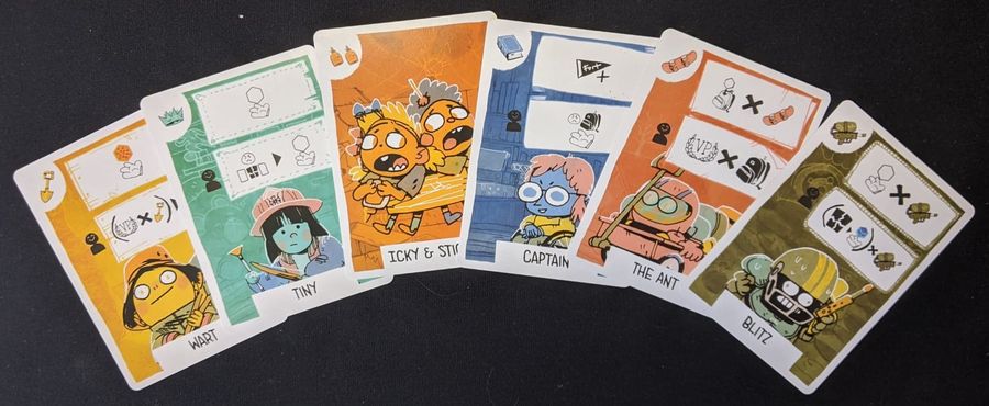
Action banners now exist on top of the art rather than inside it. Actions are now fully separated by banners. The top banner became exclusively for public actions, and the bottom banner became exclusively for private actions and was reinforced with a small icon. This graphical approach created a clear distinction between UI elements and art elements, and made the game’s long list of unique cards more consistent.
:strip_icc()/pic5480800.jpg)
Next week we’ll be exploring the world of Fort, its art, and its inspirations!
- Nich Brachmann
Find the original post and associated discussion on Board Game Geek.