:strip_icc()/pic5732588.png)
I live in Massachusetts, not in Minnesota with the rest of the Leder team, so remote work is already natural for me, but the pandemic cut down our collective ability to set up spur-of-the-moment tests with new people. In the Before Times, I could get an event scheduled for playtesting at my local game night, have friends come over and try out the game for the first time, or ask for tidbits of feedback from random people in exchange for a coffee. That's no longer true, so as a publisher we invested much more time and money than normal into remote testing—for discussion we used Discord, and for testing we used Tabletop Simulator.
The major advantage of remote testing is that you can scale up the amount of feedback you get by huge margins. As Cole has mentioned elsewhere, most of the burden of testing shifts away from the playtesters themselves, since they no longer need to hand-construct kits, and onto the developers. In this case, much of it shifted onto AgentElrond, our wonderful Tabletop Simulator mod developer, so big thanks to him! Without him, we would’ve had one hell of a time getting Oath finished.
And we needed tons of feedback! Oath is a big, deep, interconnected game—the number of unique card effects is an order of magnitude higher than any game we’ve done before (~240 versus ~50 in Root), and because Oath’s systems are so tightly interconnected, each one of those effects has to be rigorously cross-checked against every other one, exploding the complexity of the task ahead.
Most video-game studios and some board-game studios have already figured this out, but let me repeat it—Discord is not just a great platform for disseminating new material for people to test, but also for running informal polls about ideas, keeping a pulse on community opinion, and hosting spontaneous discussions. I can’t tell you the number of times I’ve had a hunch or just needed another eye, and the Discord was there for it.
:strip_icc()/pic5732408.png)
However, lots of information means lots of information management. By the end, we were keeping track of three notable Discord servers, the BoardGameGeek forums, Kickstarter comments, along with emails, Twitter replies, Reddit threads, and so on. And quite often, I’d see the little red notification dot on my Discord, pop into the server, and see a notification like this one:
:strip_icc()/pic5732413.png)
Exciting! But also intimidating. This experience gave me a renewed respect for community managers, since in essence that’s what Cole and I became, along with wearing various other hats: designer, developer, editor, graphic designer, etc. Going forward, we're definitely going to keep working with our online communities as much as we did on Oath, and my hope is that we can also get a dedicated community manager on board so we don't miss any important info and to make sure everyone’s voice is heard. We don’t yet know how much the pandemic played into the availability of people in our online communities, or whether they will remain quite as active once we’re (thankfully) out of the pandemic woods, but I sure hope they will!
Another lesson we learned about Tabletop Simulator testing is to account for lead time. Quite often, when we pushed an update for the TTS, the content was already a few days to a week old, which meant we received a lot of feedback on issues that we’d already fixed. Obviously this isn’t fair to the players who spent time reporting the issue, so in future projects I plan to release a Known Issues report along with each new TTS update.
:strip_icc()/pic5732605.png)
Physical Testing
Using TTS for playtesting has many advantages, but it has one big disadvantage—you’re not actually testing a physical experience. You get no idea of how to answer questions like “Is the place for the deck out of reach of most players? Do you have to crane your neck too much to see certain things? Is the text too small?” In TTS, you can just hit a couple buttons and instantly zoom in on any game component, a feature that we fleshy humans don’t have yet. This is great for TTS players, but bad for getting good information about how people will experience the game when it hits a table made out of wood or plastic or glass, rather than pixels.
Since we absolutely did need to test the physical experience, we solicited many groups to ship kits out to. (This ended up being its own trial, since the USPS has hit a lot of problems recently!) One goal of our physical playtesting was to validate our walkthrough and card-based first-game setup, especially since the card-based setup is useless on TTS—the program does the work for you!—so there was no sense in reproducing it there. We caught dozens and dozens of problems in these tests, including a really funny one shown in this clip:
In case you didn’t understand, the teacher had read a card that said “Flip Me Over” and flipped over the entire card deck rather than the card itself. I love this clip because it perfectly shows how a small tweak in wording (in this case, "flip me over" versus "flip this card over") can cause huge consequences, and how we the developers are often totally blind to these consequences until groups reveal them. We owe so much to our testers—their frustration prevented the frustration of an untold number of other people.
Choosing the Right Words
We spend more time talking about terminology in Oath’s dev than in any game we’ve made. Many terms changed multiple times, sometimes back to an older term! Oath, like most of our other games, tells stories not through narrative text but through its systems, so its art and text alike must help you envision what’s happening in the world. In this case too, the playtesting Discord provided an excellent sounding board for ideas about terminology.
:strip_icc()/pic5732414.png)
Over the course of these many discussions, some rules of thumb for choosing good terminology came into better focus for me, so here they are. I’m still not happy with some of the game’s terms—and I never am; I’m looking at you, “craft” in Root—but as with many things in game development, picking terminology is all about trade-offs and compromises, and sometimes there just isn't a perfect term given its requirements.
The term should be distinct. For a while, we called Supply “Focus,” but people would often confuse “favor” and “Focus,” causing an uncountable number of “Wait, did you mean favor or Focus?” moments, since favor and Supply are two of the most commonly used resources in the game. Naturally, this slowed games down, so it had to go. While Supply isn’t a perfectly distinct term, since “supply” is a common board game keyword with a different meaning, it proved to be much less problematic than “Focus” and it accomplished many other goals, as I’ll discuss in the next point.
The term should give the right thematic intuitions. The other reason we moved away from “Focus” was that it didn’t map cleanly to what was happening in the world. For example, you can certainly “refresh” your Focus, but can you “save” Focus? Unclear. The term before Focus, “Effort,” likewise didn’t fit cleanly—it wasn’t really Effort that you refreshed, but Will or Vigor or some physical property. But the larger problem was that neither Focus nor Effort truly helped players connect warbands with refreshing. The more warbands you have mustered, the less Supply you refresh at the end of your turn. Since Supply is a concrete concept, it’s easier to draw a connection—as it says in the Playbook, “The fewer warbands you’ve mustered and need to feed, the more Supply you’ll have for yourself.” It takes much more hand-waving to explain how warbands relate to abstract concepts like Focus or Effort.
The term should play well with other terms. This was a big motivation for the change from “Play” to “Search” relatively early in development. “I’m going to play…” doesn’t let you smoothly describe what you’re doing. You might say, “I’m going to play from the deck…” but that doesn’t even sound like what you’re actually doing—you’re drawing cards first. And calling the action “Draw” doesn’t really work either since, you’re also playing. So, what to do? Sidestep it by thinking about theme and where it overlaps with understood game terms—in this case, Search fit the bill. “Search a deck” is already a common term in other games, and thematically you are actually looking around for new denizens to muster and trade with.
Deeper word mechanics can also influence term choices. For example, at one point the Trade action was called “Inspire,” but this produced all kinds of unthematic sentences like “I’m going to inspire the Forest Paths.” In contrast, “Trade” lets you use prepositions to conjure up an unseen third party—“I’m going to trade at the Forest Paths.” Who are you trading with exactly? We’ll leave this up to you! Likewise, it slots in nicely elsewhere, “I’m going to trade with the Elders,” “I’m going to trade at the Gathering,” or “I’m going to trade for Rain Boots.” Okay, maybe the last one doesn’t work so well, but we like Rain Boots too much in concept to rename the card. Deal with it! Trade-offs!
The term should be vivid and come naturally. At one time, Oath had an action called Encounter, which bundled together Trade, Muster, and another action called Hobnob, which interfaced with the old Courts system. We had bundled these actions together since there were just too many actions at the time—eight!—which bogged down teaching and made the game feel overwhelming unnecessarily. But the term “Encounter” was trying to accomplish so many things that it wasn’t vivid—it was difficult to visualize, and it just didn’t mean anything anymore. (To me, at least—Cole might disagree!)
We ended up unbundling Encounter into Muster and Trade. (Hobnob and another action, Proclaim, had since disappeared, which reduced the total number of actions.) But why keep Muster as its own action different from Trade? After all, you’re doing practically the same thing—putting some favor or secrets on a card to get something back. Quite simply: because people just liked saying “Muster.” It felt natural. And often, that’s enough.
Perhaps surprisingly, I’m not totally happy with “favor” as a term because tons of people still just say “cash” or “money”—even us! This, of course, isn’t helped by the favor tokens looking like coins. In the end, though, this resource acts like favor in too many ways for us to call it anything but favor, so it stays.
:strip_icc()/pic5732600.png)
Leaning into the Weirdness
One thing that became clear to me soon after Oath’s Kickstarter campaign was that writing its rulebook was going to be hard, much harder than for Root. Most of the early rulebook feedback was negative. It was hard to reference the information you needed, and it was hard to get a broad idea of the game early on. It was the worst of both worlds. For a while it was difficult to figure out why this was happening, but one piece of feedback crystallized the problem for me: “The rulebook is worse off because it tries as hard as it can to hide all the weird stuff.”
This is 100% true. Oath is an extreme sandbox game with many distinct ways to win, some which are available at the start, some which become available over time and some which may never become available in a game. The players share many core concepts, but some of those core concepts are real heavy (looking at you, Campaign). The cards themselves can be absurd—a given card can be utter trash in one moment and godlike in the next. Sharp edges abound. Even now, I’ll often start a game, look at my opening hand, and feel totally lost. This is a feature, not a bug, but it can be stressful and overwhelming if you’re not prepared for it.
So rather than trying to hide the weirdness, I leaned into it by giving people as many tools as possible to deal with it and enjoy it. Thankfully, I was able to test out all of these tools extensively, in to small part to the dozen or so readers we brought in to read through the rulebook blind, along with everyone in our physical tests and out here on the internet. Here are a few ways I tackled this issue.
/pic5732592.png)
Card-based setup and walkthrough
Card-based setup and walkthrough
:strip_icc()/pic5732486.png)
Oath is interconnected and difficult to teach linearly. A simple question about favor can lead to questions about Trade, which leads to questions about advisers, which leads to questions about Search, which leads to questions about the Visions Drawn track, which leads to questions about Visions, which... You get the point. If you’re not an experienced teacher of Oath, it’s hard to figure out what to teach. Because of this, we wrote the playbook to give people a guided introduction to the game. After reading a few pages of core rules, the playbook nudges you toward the walkthrough:
:strip_icc()/pic5732470.png)
The walkthrough, in turn, introduces concepts gradually at the time that they’re most helpful. We also leaned more into the call-and-response style that we tried out first in Root’s booklet-based walkthrough included in the fourth printing, where we give the basic action to start, and then dig more into the reasons why things worked out they way they did in some subtext below.
:strip_icc()/pic5732471.png)
One thing that many people asked for in Root’s walkthrough was more explicit discussion of “Why am I doing this?”, so we made sure to do just that.
:strip_icc()/pic5732473.png)
Finally, since each player is going to end up with a different position at the end of the walkthrough, we also give recommendations for playing specific colors if you want to focus on certain playstyles.
:strip_icc()/pic5732475.png)
All that said, we’ve designed the playbook so that if you don’t want to go through the walkthrough, you don’t have to! If you’re pressed for time before your first game, you can even teach straight out of the playbook—we’ve written it specifically so you can read it aloud if you need to, and the book will let you know when you’re getting in a bit too deep if you haven’t played at all yet.
:strip_icc()/pic5732445.png)
The Tips and Expectations section
Oath can last up to eight rounds, but it can end almost immediately if you let it. This leads to lots of different, interesting stories, but it can also catch people off guard. Likewise, Oath plays very differently depending on your player count. Aligning expectations with your players for your first game is important!
:strip_icc()/pic5732477.png)
Why Do I Want to…? sidebars
Context is king for teaching Oath, and these sidebars give explicit ideas of how the actions hook into play. I was a little skeptical of them first, since the last thing I want Oath to be is patronizing, but the response I got from people who read the rulebook for the first time was overwhelmingly positive. Almost everyone loved them.
:strip_icc()/pic5732480.png)
The Group Agreements page
:strip_icc()/pic5732477.png)
Why Do I Want to…? sidebars
Context is king for teaching Oath, and these sidebars give explicit ideas of how the actions hook into play. I was a little skeptical of them first, since the last thing I want Oath to be is patronizing, but the response I got from people who read the rulebook for the first time was overwhelmingly positive. Almost everyone loved them.
:strip_icc()/pic5732480.png)
The Group Agreements page
:strip_icc()/pic5732482.png)
The Campaign aid
A late-comer weirdness support is the “Is this a good idea?” sidebar on the campaign summary aid. Basically, the attack and defense dice in Oath scale differently, which is essential to making Oath’s campaign system work—some people call the defense dice “hubris dice,” which is exactly true—but the dice math can leave some people feeling a little scared to campaign in the first place. Ultimately, this fear can warp the game experience into something much more passive, so this little helper should ease that trepidation.:strip_icc()/pic5732446.png)
Online card database and FAQ
The Weird Things About Oath page
The Weird Things About Oath page
:strip_icc()/pic5732462.png)
Iterate, Iterate, Iterate
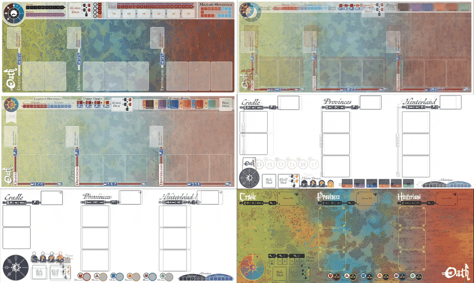
Let’s finish this off with some nice animations. Oath had more people working on it than any game we’ve produced before. This let us iterate on all elements of the game—design, box, components, etc.—in a much more rapid, dramatic fashion than before. A great example is the map, which went through a few dozen significant iterations, variously produced by me, Cole, Pati (graphic design lead), and Nick (developer and graphic designer). As with many parts of Oath, this was an extremely collaborative effort. Here’s a selection of them from mid to late development:
Often, to find a way through a problem, it’s just easiest to play around with outlandish solutions—Cole sometimes calls it “swinging for the fences”—and see what sticks. Of course, sometimes we tried this and whiffed, so let me talk about one of my own swing-and-a-miss moments. For many months, the player boards had been sitting with largely the same design, and I was curious whether we were missing any huge opportunities. So I cut ’em up!:strip_icc()/pic5732439.jpg)
This is a great technique if you find yourself in a layout rut, since it helps you recontextualize the individual elements—”What if we just got rid of this altogether? Then how could we move around and reshape the other stuff?” But it didn’t bear any major fruit. Probably the best of my radical redesigns was my “Quentin Tarantino board.”:strip_icc()/pic5732443.png)
But...this design has a bunch of usability problems—the track isn’t clearly labeled, the actions broken over two columns make them harder to parse, there’s no sense of what advisers are physically, and so on. But what ultimately killed this redesign is just that it’s off-step with the theme. It feels more like something out of an edgy modern fighting game than a mythical fantasy strategy game. Nick thought so too, and affectionately summed up those feelings with this image::strip_icc()/pic5732437.png)
But though we didn’t commit to this direction in full, the conversations about the player boards did lead to improvements, many of them prompted by our excellent graphic design lead, Pati Hyun. We thought more critically about where to place the interface elements for favor, secrets, and warbands, and eventually we abandoned labeling specific places for them on the board. This let us move the Vision card slot from off the left side of the board to the board itself, which earned us the space we needed to put action icons in the left pane, and it let us note how Vision cards worked on the board itself, which is important since Visions are, after all, a critical victory condition for Exiles.
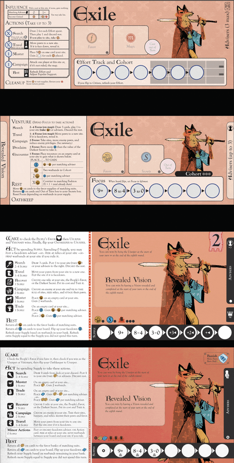
Since I gave you a gif for the map, why not one for the player boards too? The text went through a nigh-million iterations, but the overall design had about four main stages:
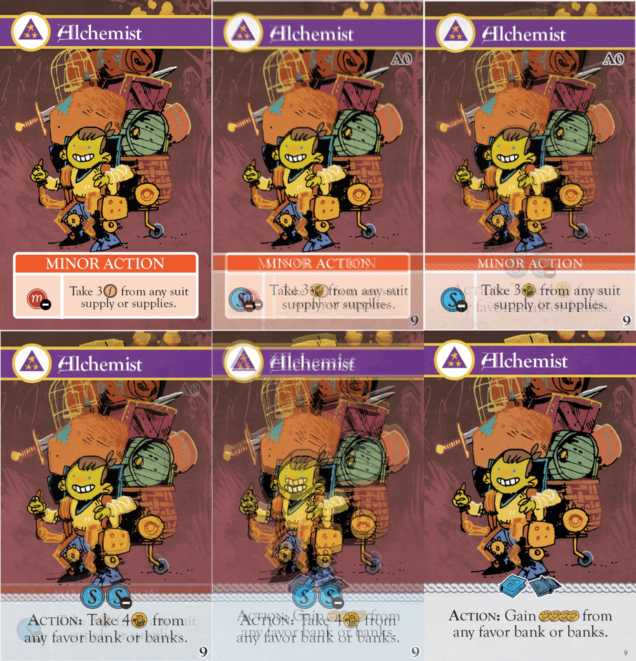
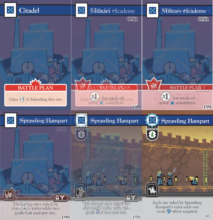
The card designs also went through a number of iterations: from partial to full frame, from labeled actions to unlabeled actions, and from overtemplating to subtler templating. Here are a couple examples:

(Note: The Sprawling Rampart's power changes over time and is no longer a battle plan. Battle plans still have the crown around the icon and a colored box, rather than a black box and no crown.)
The idea to remove the card labels was Pati's, and honestly I was a bit skeptical of it at first. With more discussion and reflection, though, I think this skepticism came from the fact that earlier versions of Oath just had so many different card types. As we had refined the game, the number of card types dropped considerably, so we could remove the labels with much lower risk, especially since we could easily re-encode some of that information in "Action:" and "Rest:" and "When Played" labels in the body text itself.
Once the labels were removed, I went on a little bit of a redesign bender, similar to the player boards. At one point, I proposed a jarringly hypertemplated version where all the possible card properties into their own icons::strip_icc()/pic5732624.png)
As with the player boards, even though we didn't go in this direction wholesale, this exercise prompted a lot of discussion and reassessment among the whole creative team about what the critical properties of the cards were and where they should be located, which informed our decisions going forward. Ultimately it cleaned up the card design quite a lot. The key nugget from the experiment above was that we could pull the cost from the left pane up to the top of the power box. This gave us a lot more room to make the text larger and better spaced, and it allowed us to make mixed costs of multiple resources, such as the combination of secret placement and burning on the Alchemist, which we just didn’t have the space for in earlier designs.
This pattern showed up again and again: experiment, throw most of the results out, but keep the one or two interesting nuggets that show promise, and see how they work. And, well, I could go on and on, but I’ll stop there. We’re really excited to get Oath into production and to you! Until next time.


:strip_icc()/pic5732596.png)